Saturday, March 12th, 2005, 5:13 am
Poor User Interfaces
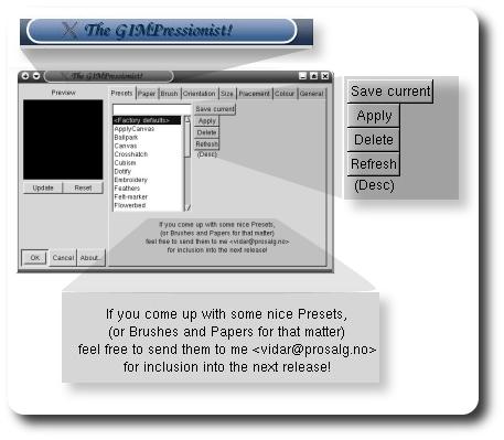
Open-source advocates must have come across odd GUI‘s where formality is neglected. An example is presented below (from GIMP 1.2.3, edited using the GIMP):

Firstly, have a look at the window title. Is the exclamation mark necessary? Secondly, look at the poor layout of the buttons. Thirdly, is the message at the bottom helpful? It does not make the application look professional. Is it inexcusable that open-source programmers cannot deploy their products in the commercial world?


 Filed under: