Medivasc Ltd.
 Filed under:
 side project of mine, FXI/Medivasc, has a new Web site with some new layout that incorporates animation. I only used Free software to produce all the graphics.


|
|


Navigation |
side project of mine, FXI/Medivasc, has a new Web site with some new layout that incorporates animation. I only used Free software to produce all the graphics.
 HE GIMP is a preferred tools to many who do not do graphics for a living (a 9-5 design job) and it has some neat scripts for banner generation. Here are some examples of banners I’ve been playing around with since last night.


 isual identity is associated with one’s mental abstraction of a concept, a person, a place, and so on. Universities use that a lot to get across their reputation, be it with a logo, a name, or some imagery of a famous site or scientist (maybe a poet). But visual identity can also aid orientation — for we all judge something that we see based on prior sights of the same (or similar) thing. This blog has had pretty much the same theme which I tailored back in 2004. Techrights has had pretty much the same design since its inception in 2006. This has little to do with convenience and more to do with how people remember those sites. Too frequent an alternation of a site’s theme (as most sites tend to do) lead to a certain disconnect and a plurality which does not help. Some things need not vary too often.
 PEN Source development is fast. Patching and development using this paradigm is particularly fast owing to modularity. Any change to the code is rather predictable within the isolated black (glass rather) boxes, so patches can be issued without laborious patching. Then comes the introduction of innovation and incorporation of code that leads to beautiful complex systems (video) very rapidly.
See video! Really, please do. I’m waiting. After I had wiped the coffee off my screen and keyboard from the excitement (well, figuratively-speaking), I came to realise that another trait of Open Source development is that it’s very responsive to user demands and needs. It’s nice to be able to submit a feature request of a bug or a patch to a project and then receive it from the development team the next cycle, for free. It’s nicer to know that millions more benefit from the same changes/inclusion, which gives the 15 pixels of fame many crave for.

The dentiny of Longhorn?
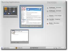
 truly enjoy a good Linux screenshot. Here is a nice OS X-type menubar, as well as a showcase for Composite transparency in X server. The menus are a brand-new GTK modification.
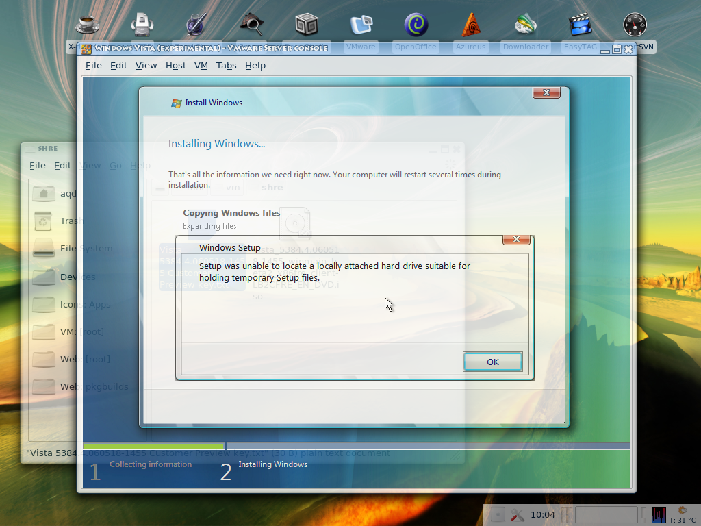
Move over to another operating system (Windows Vista under a Linux hypervisor) and find that there still appear to be many problems with the latest beta. It’s a good thing that Microsoft does not name/label its operating systems by the year. With all these delays, this could become very embarrassing and confusing. And I also found the following article this morning.
“I have been testing Microsoft operating systems since Windows 95, and this is the buggiest OS I’ve seen this late in development,” says Joe Wilcox, an analyst with Jupiter Research. “Look at the older operating systems, and by Beta 2 there is a stable foundation on which the [independent software vendors] can build. Right now, Vista is like a ship on stormy seas.”
 ERE is the latest find (a video) which illustrates how beautiful and powerful Linux has become. It is a showcase of dual-head with Compiz/XGL, all under a GNOME desktop. Some continue to argue, backed by myths, that GNOME and KDE are ugly and/or hard to use. I refuted both claims, I hope. Some would say that Fedora does not look so nice ‘out of the box’ (truly a matter of personal opinion). Nevertheless, just like any Linux distribution, it’s extensible and customisable. Here are two visual examples that I could quickly find on
 KDE-look.org:
Related item: GNOME and XGL Showcases

Baghira Mac OS X lookalike for KDE
 INUX can be assimilated to merely any desktop environment, including the appearance of its rivals’ desktops. It can endlessly adapt, particularly layout-wise, although look-and-feel is getting there too. Different interfaces (achievable through desktop environment), as well as various addons, make this truer than ever before. There are several design sets lying about, which enable Linux to look and behave merely like any other operating system. Here are a few examples that I collected recently:
Another nice style that I found is Noia for KDE (version 1).
Here are some sets of instructions of interest. These are step-by-step recipes to achieving some of what’s shown above:
Retrieval statistics: 21 queries taking a total of 0.119 seconds • Please report low bandwidth using the feedback form
Original styles created by Ian Main (all acknowledgements) • PHP scripts and styles later modified by Roy Schestowitz • Help yourself to a GPL'd copy
|— Proudly powered by W o r d P r e s s — based on a heavily-hacked version 1.2.1 (Mingus) installation —|