


Helper Box
 Filed under:
  N the middle of last year I found myself with an extra new widescreen monitor that could not be used because my graphics card only supports up to two monitors. I pondered buying a new graphics card to add a third or fourth monitor to the same box, but this turned out to be uneconomic. So instead I bought an extra box and installed Debian Squeeze on it. It would add a processor to my setup and also help stay connected when either of the machine requires downtime. Over time I learned how to properly use this “helper box”, which is connected to a separate mouse and keyboard. It is mostly used for monitoring of information that changes over time.
I decided to share the lessons I have learned about what and how to monitor things using this type of “helper box”. Here is a screenshot that can be viewed in full size by clicking it.

What’s shown here are 7 main components (some of which are hidden). The top left shows the tracking of one IRC channel in real-time, the bottom left shows another (singleton requires different IRC clients to be used). The bottom right displays the “top” output of Web servers (also enabling intervention in case things go awry)). This uses a KDE plasmoid that generally looks quite good and will appear in all workspaces. The same goes for the browser plasmoid at the top right (usually pointing to JoinDiaspora and updating/refreshing once in 5 minutes – there is an option for that). Weather forecast is displayed using another plasmoid and hidden behind the IRC windows are two folderview plasmoids that over SSH connect to the main box and thereby enable simple sharing of files — including text — across the two boxes. The main panel displays the time and date, but very little of interest apart from that. The wallpaper changes based on the current weather (it is a feature of Plasma desktop).
Moving one’s head to this box leads to absorption of a lot of information, which is worth the electricity cost.


 HAT is all that nonesense that we find in the news about “OpenOffice.org lacking a mail and collaboration” component? Office suites are made to produce files, not to communicate directly with people. The instant messenger and the mail clients might be suitable for integration. The FTP client and the file manager also. But just as the Web browser (page renderer) never belonged next to/inside a file manager, the mail clients (e.g. Thunderbird) should remain separate from tools that are used to put together and manage complex data.
 HE “what you see is what you get” paradigm is a fine idea. This term, abbreviated WYSIWYG (and sometimes pronounced Wisi-wig), aptly describes the way we print our documents. From a particular image on our monitor we are able to produce paper replicas. But should the same paradigm be used for composition of our documents? Should layout itself be manipulated and controlled by the user in real time? Scott McNealy
 TUDIES which analyse large volumes of communication have always been interesting. For instance, most of the E-mail traffic nowadays is identified as SPAM; and over 80% of it is said to come from compromised Windows PC‘s. However, for a change, this is not what I wish to discuss today. I don’t want to have yet another bite at the effects Windows has on the WWW. It leaves me bitter.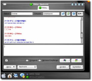

 ESTERDAY I had a cursory look at

